Gemini

Gemini

Client

Google

Scope

Visual System

Role

Art Director

Year

2025

An intuitive visual language rooted in clarity, warmth, and direction, using form and gradients to streamline complex intelligence.

An intuitive visual language rooted in clarity, warmth, and direction, using form and gradients to streamline complex intelligence.

Brand Identity

Strategy

Design System

Product

Solving Complexity

Gemini needed to express an extraordinarily capable AI without making the experience feel complex. The challenge was to create a visual language that could bring clarity to the product, guide users intuitively through different modes of interaction, and flex across an evolving ecosystem without competing with the intelligence itself.

Creating Clarity

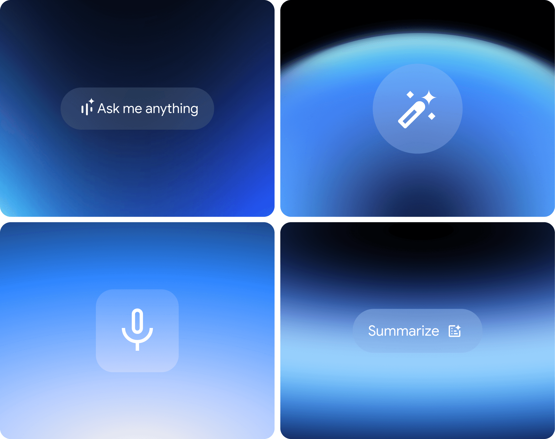
We created a reductive system where gradients behave as a guiding energy, responding to human input with intention and depth. Paired with clear hierarchy and fluid behaviors across voice, UI, iconography, and key product moments, the system gives Gemini's endless capabilities a presence that feels approachable and intuitive.

Solving Complexity

Gemini needed to express an extraordinarily capable AI without making the experience feel complex. The challenge was to create a visual language that could bring clarity to the product, guide users intuitively through different modes of interaction, and flex across an evolving ecosystem without competing with the intelligence itself.

Creating Clarity

We created a reductive system where gradients behave as a guiding energy, responding to human input with intention and depth. Paired with clear hierarchy and fluid behaviors across voice, UI, iconography, and key product moments, the system gives Gemini's endless capabilities a presence that feels approachable and intuitive.

Visual Elements

Historically, Google used expressive shapes and characters to communicate a sense that “more is more.” For Gemini, we crafted a "less is more" approach that visually streamlines complex experiences to always guide a user toward clarity.

Within this system, gradients are a guiding force of energy to signify human input, intention, and direction.

This principle extends across key UI touchpoints, shaping the visual hierarchy and compositional balance of the Gemini spark, visualized UI gestures, icons, and voice activation.

Color & UI

Gemini's core palette is a concentration of the Google's wider range;a focused portion of the RGB spectrum. The palette allows for a wide range of gradients and seamless color blends. These gradients create a sense of forward momentum, intentionality, and approachability.

When Gemini appears in a Google environment, the palette is always the main hero, with Google colors supporting.

Motion Behavior

Specific motion techniques such as offsetting, color shifts, expansion, dynamic dissolves, and concentrating diffusion create a unified and intentional motion language that spans across the system.

From the gradients to the Gemini spark, motion is always confident and clear, intentionally guiding the user across UI touchpoints.

Next ProjectNext Project
Chief Design OfficerBen Langsfeld
Creative DirectionGosha Kuznetsov, Ana Bernaus
Art DirectionTwisha Patni
ProductionMackenzie Kuzman, Haley Arenson, Flo Fusco
StrategyAsia Hunt
DesignHaeri Cho, Jade Kuzak, Julia Chu, Daniela Chun, Heewon Kim
AnimationHannah Sun, Patrick Knip, Morgan Allison, Ryoko Kondo
Next ProjectNext Project
Chief Design OfficerBen Langsfeld
Creative DirectionGosha Kuznetsov, Ana Bernaus
Art DirectionTwisha Patni
ProductionMackenzie Kuzman, Haley Arenson, Flo Fusco
StrategyAsia Hunt
DesignHaeri Cho, Jade Kuzak, Julia Chu, Daniela Chun, Heewon Kim
AnimationHannah Sun, Patrick Knip, Morgan Allison, Ryoko Kondo